GLM for Between Subjects Data - R
Contents
GLM for Between Subjects Data - R#
GLM for Normal Distribution Data#
Distribution: Normal
Link: identity
Typical Uses: Linear Regression: equivalent to linear (mixed) model (
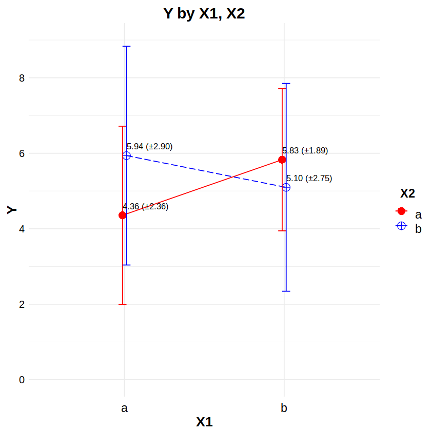
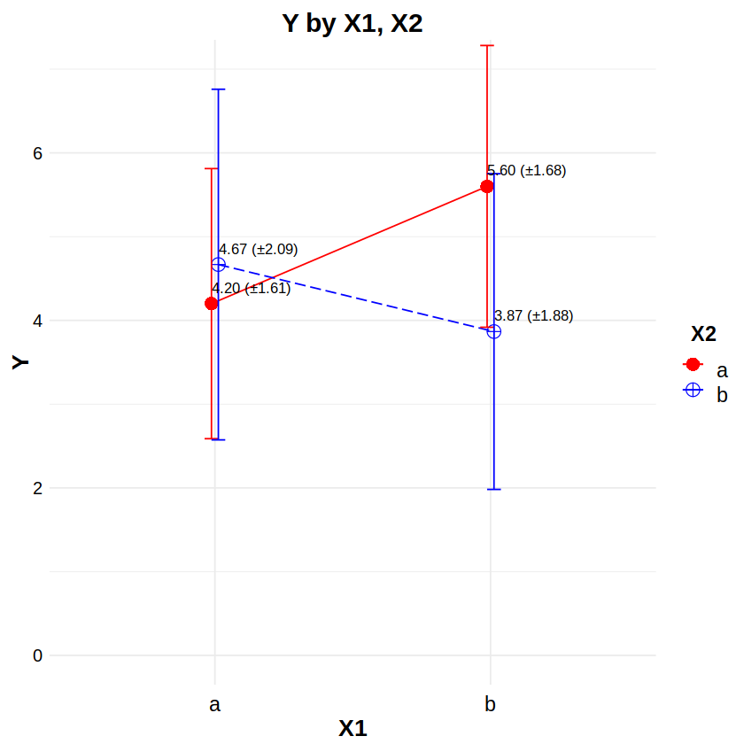
lm/lmm)Reporting: “Figure 12a shows an interaction plot with ±1 standard deviation error bars for X1 and X2. An analysis of variance based on linear regression indicated a statistically significant effect on Y of X1 (F(1, 56) = 7.06, p < .05), but not of X2 (F(1, 56) = 1.02, n.s.). Also, the X1×X2 interaction was not statistically significant (F(1, 56) = 2.74, n.s.).”
# Example data
# df has subjects (S), two between-Ss factors (X1,X2) each w/levels (a,b), and continuous response (Y)
df <- read.csv("data/2F2LBs_normal.csv")
head(df, 20)
| S | X1 | X2 | Y | |
|---|---|---|---|---|
| <int> | <chr> | <chr> | <dbl> | |
| 1 | 1 | a | a | 9.587838 |
| 2 | 2 | a | b | 9.217284 |
| 3 | 3 | b | a | 10.663489 |
| 4 | 4 | b | b | 14.932123 |
| 5 | 5 | a | a | 5.157908 |
| 6 | 6 | a | b | 11.025094 |
| 7 | 7 | b | a | 10.741292 |
| 8 | 8 | b | b | 3.169121 |
| 9 | 9 | a | a | 10.863238 |
| 10 | 10 | a | b | 6.244845 |
| 11 | 11 | b | a | 14.949621 |
| 12 | 12 | b | b | 10.081778 |
| 13 | 13 | a | a | 6.167002 |
| 14 | 14 | a | b | 7.761871 |
| 15 | 15 | b | a | 12.335185 |
| 16 | 16 | b | b | 8.212590 |
| 17 | 17 | a | a | 6.552768 |
| 18 | 18 | a | b | 10.075766 |
| 19 | 19 | b | a | 13.765247 |
| 20 | 20 | b | b | 9.038398 |
library(car) # for Anova
df$S = factor(df$S)
df$X1 = factor(df$X1)
df$X2 = factor(df$X2)
contrasts(df$X1) <- "contr.sum"
contrasts(df$X2) <- "contr.sum"
m = glm(Y ~ X1*X2, data=df, family=gaussian)
Anova(m, type=3, test.statistic="F")
Loading required package: carData
| Sum Sq | Df | F values | Pr(>F) | |
|---|---|---|---|---|
| <dbl> | <dbl> | <dbl> | <dbl> | |
| X1 | 61.014582 | 1 | 7.061331 | 0.01024486 |
| X2 | 8.787594 | 1 | 1.017005 | 0.31756830 |
| X1:X2 | 23.639063 | 1 | 2.735793 | 0.10371815 |
| Residuals | 483.877154 | 56 | NA | NA |
library(ggplot2)
library(ggthemes)
library(scales)
library(plyr)

# Interaction plot
# http://www.sthda.com/english/wiki/ggplot2-line-plot-quick-start-guide-r-software-and-data-visualization
# http://www.sthda.com/english/wiki/ggplot2-error-bars-quick-start-guide-r-software-and-data-visualization
# http://www.sthda.com/english/wiki/ggplot2-point-shapes
# http://www.sthda.com/english/wiki/ggplot2-line-types-how-to-change-line-types-of-a-graph-in-r-software
df2 <- ddply(df, ~ X1*X2, function(d) # make a summary data table
  c(NROW(d$Y),
    sum(is.na(d$Y)),
    sum(!is.na(d$Y)),
    mean(d$Y, na.rm=TRUE),
    sd(d$Y, na.rm=TRUE),
    median(d$Y, na.rm=TRUE),
    IQR(d$Y, na.rm=TRUE)))
colnames(df2) <- c("X1","X2","Rows","NAs","NotNAs","Mean","SD","Median","IQR")
ggplot(data=df2, aes(x=X1, y=Mean, color=X2, group=X2)) + theme_minimal() +
  # set the font styles for the plot title and axis titles
  theme(plot.title   = element_text(face="bold",  color="black", size=18, hjust=0.5, vjust=0.0, angle=0)) +
  theme(axis.title.x = element_text(face="bold",  color="black", size=16, hjust=0.5, vjust=0.0, angle=0)) +
  theme(axis.title.y = element_text(face="bold",  color="black", size=16, hjust=0.5, vjust=0.0, angle=90)) +
  # set the font styles for the value labels that show on each axis
  theme(axis.text.x  = element_text(face="plain", color="black", size=14, hjust=0.5, vjust=0.0, angle=0)) +
  theme(axis.text.y  = element_text(face="plain", color="black", size=12, hjust=0.0, vjust=0.5, angle=0)) +
  # set the font styles for the legend
  theme(legend.title = element_text(face="bold", color="black", size=14, hjust=0.5, vjust=0.0, angle=0)) +
  theme(legend.text  = element_text(face="plain", color="black", size=14, hjust=0.5, vjust=0.0, angle=0)) +
  # create the plot lines, points, and error bars
  geom_line(aes(linetype=X2), position=position_dodge(0.05)) +
  geom_point(aes(shape=X2, size=X2), position=position_dodge(0.05)) +
  geom_errorbar(aes(ymin=Mean-SD, ymax=Mean+SD), position=position_dodge(0.05), width=0.1) +
  # place text labels on each bar
  geom_text(aes(label=sprintf("%.2f (±%.2f)", Mean, SD)), position=position_dodge(0.05), hjust=0.0, vjust=-1.0, color="black", size=3.5) +
  # set the labels for the title and each axis
  labs(title="Y by X1, X2", x="X1", y="Y") +
  # set the ranges and value labels for each axis
  scale_x_discrete(labels=c("a","b")) +
  scale_y_continuous(breaks=seq(0,14,by=2), labels=seq(0,14,by=2), limits=c(0,14), oob=rescale_none) +
  # set the name, labels, and colors for the traces
  scale_color_manual(name="X2", labels=c("a","b"), values=c("red", "blue")) +
  # set the size and shape of the points
  scale_size_manual(values=c(4,4)) +
  scale_shape_manual(values=c(16,10)) +
  # set the linetype of the lines
  scale_linetype_manual(values=c("solid", "longdash"))
GLM for Binomial Distribution Data#
Distribution: Binomial
Link: logit
Typical Uses: Logistic Regression: dichotomous responses (i.e. nominal responses with two categories)
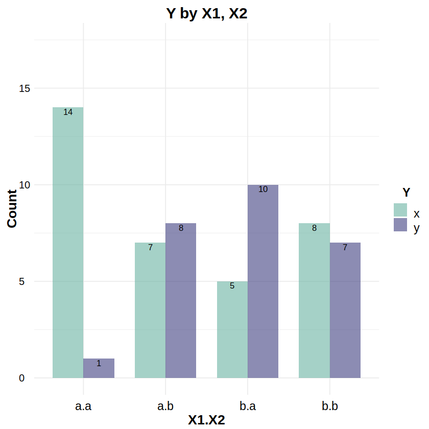
Reporting: “Figure 13a shows the number of ‘x’ and ‘y’ outcomes for each level of X1 and X2. An analysis of variance based on logistic regression indicated a statistically significant effect on Y of X1 (χ2(1, N=60) = 6.05, p < .05) and of the X1×X2 interaction (χ2(1, N=60) = 8.63, p < .01), but not of X2 (χ2(1, N=60) = 2.27, n.s.)”
# Example data
# df has subjects (S), two factors (X1,X2) each w/levels (a,b), and dichotomous response (Y)
df <- read.csv("data/2F2LBs_binomial.csv")
head(df, 20)
| S | X1 | X2 | Y | |
|---|---|---|---|---|
| <int> | <chr> | <chr> | <chr> | |
| 1 | 1 | a | a | x |
| 2 | 2 | a | b | y |
| 3 | 3 | b | a | y |
| 4 | 4 | b | b | y |
| 5 | 5 | a | a | x |
| 6 | 6 | a | b | y |
| 7 | 7 | b | a | y |
| 8 | 8 | b | b | x |
| 9 | 9 | a | a | x |
| 10 | 10 | a | b | y |
| 11 | 11 | b | a | x |
| 12 | 12 | b | b | x |
| 13 | 13 | a | a | x |
| 14 | 14 | a | b | x |
| 15 | 15 | b | a | x |
| 16 | 16 | b | b | x |
| 17 | 17 | a | a | y |
| 18 | 18 | a | b | x |
| 19 | 19 | b | a | y |
| 20 | 20 | b | b | x |
library(car) # for Anova
df$S = factor(df$S)
df$X1 = factor(df$X1)
df$X2 = factor(df$X2)
df$Y = factor(df$Y) # nominal response
contrasts(df$X1) <- "contr.sum"
contrasts(df$X2) <- "contr.sum"
m = glm(Y ~ X1*X2, data=df, family=binomial)
Anova(m, type=3)
| LR Chisq | Df | Pr(>Chisq) | |
|---|---|---|---|
| <dbl> | <dbl> | <dbl> | |
| X1 | 6.045796 | 1 | 0.013939447 |
| X2 | 2.268063 | 1 | 0.132064859 |
| X1:X2 | 8.631018 | 1 | 0.003304868 |
library(ggplot2)
library(ggthemes)
library(scales)
library(plyr)

# Barplot
# http://www.sthda.com/english/wiki/ggplot2-barplots-quick-start-guide-r-software-and-data-visualization
# https://stackoverflow.com/questions/51892875/how-to-increase-the-space-between-grouped-bars-in-ggplot2
df2 <- as.data.frame(xtabs(~ X1+X2+Y, data=df))
df2$X12 = with(df2, interaction(X1, X2))
df2$X12 = factor(df2$X12, levels=c("a.a","a.b","b.a","b.b"))
df2 <- df2[order(df2$X1, df2$X2),] # sort df2 alphabetically by X1, X2
ggplot(data=df2, aes(y=Freq, x=X12, fill=Y)) + theme_minimal() +
  # set the font styles for the plot title and axis titles
  theme(plot.title   = element_text(face="bold",  color="black", size=18, hjust=0.5, vjust=0.0, angle=0)) +
  theme(axis.title.x = element_text(face="bold",  color="black", size=16, hjust=0.5, vjust=0.0, angle=0)) +
  theme(axis.title.y = element_text(face="bold",  color="black", size=16, hjust=0.5, vjust=0.0, angle=90)) +
  # set the font styles for the value labels that show on each axis
  theme(axis.text.x  = element_text(face="plain", color="black", size=14, hjust=0.5, vjust=0.0, angle=0)) +
  theme(axis.text.y  = element_text(face="plain", color="black", size=12, hjust=0.0, vjust=0.5, angle=0)) +
  # set the font styles for the legend
  theme(legend.title = element_text(face="bold", color="black", size=14, hjust=0.5, vjust=0.0, angle=0)) +
  theme(legend.text  = element_text(face="plain", color="black", size=14, hjust=0.5, vjust=0.0, angle=0)) +
  # create the barplots side-by-side
  geom_col(width=0.75, position=position_dodge(width=0.75), alpha=0.60) +
  # place text labels on each bar
  geom_text(aes(label=Freq), position=position_dodge(width=0.75), vjust=1.2, color="black", size=3.5) +
  # set the labels for the title and each axis
  labs(title="Y by X1, X2", x="X1.X2", y="Count") +
  # change the order of the bars on the x-axis
  scale_x_discrete(limits=c("a.a","a.b","b.a","b.b")) +
  # set the scale, breaks, and labels on the y-axis
  scale_y_continuous(breaks=seq(0,17.5,by=5), labels=seq(0,17.5,by=5), limits=c(0,17.5), oob=rescale_none) +
  # set the name, labels, and colors for the boxes
  scale_fill_manual(name="Y", labels=c("x","y"), values=c("#69b3a2","#404080"))
GLM for Multinomial Distribution Data#
Distribution: Multinomial
Link: logit
Typical Uses: Multinomial Logistic Regression: polytomous responses (i.e. nominal responses with more two categories)
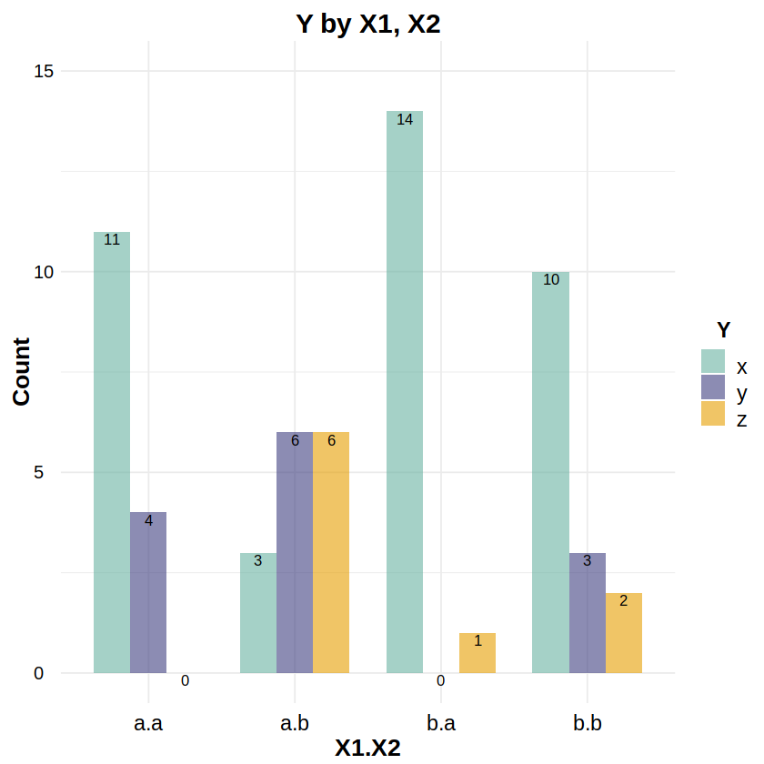
Reporting: “Figure 14a shows the number of ‘x’, ‘y’, and ‘z’ outcomes for each level of X1 and X2. An analysis of variance based on multinomial logistic regression indicated a statistically significant effect on Y of X1 (χ2(2, N=60) = 10.46, p < .01), of X2 (χ2(2, N=60) = 15.21, p < .001), and a marginal X1×X2 interaction (χ2(2, N=60) = 5.09, p = .078).”
# Example data
# df has subjects (S), two between-Ss factors (X1,X2) each w/levels (a,b), and polytomous response (Y)
df <- read.csv("data/2F2LBs_multinomial.csv")
head(df, 20)
| S | X1 | X2 | Y | |
|---|---|---|---|---|
| <int> | <chr> | <chr> | <chr> | |
| 1 | 1 | a | a | x |
| 2 | 2 | a | b | z |
| 3 | 3 | b | a | x |
| 4 | 4 | b | b | x |
| 5 | 5 | a | a | x |
| 6 | 6 | a | b | x |
| 7 | 7 | b | a | x |
| 8 | 8 | b | b | x |
| 9 | 9 | a | a | y |
| 10 | 10 | a | b | x |
| 11 | 11 | b | a | x |
| 12 | 12 | b | b | z |
| 13 | 13 | a | a | x |
| 14 | 14 | a | b | y |
| 15 | 15 | b | a | x |
| 16 | 16 | b | b | x |
| 17 | 17 | a | a | x |
| 18 | 18 | a | b | x |
| 19 | 19 | b | a | x |
| 20 | 20 | b | b | x |
library(nnet) # for multinom
library(car) # for Anova
df$S = factor(df$S)
df$X1 = factor(df$X1)
df$X2 = factor(df$X2)
df$Y = factor(df$Y) # nominal response
contrasts(df$X1) <- "contr.sum"
contrasts(df$X2) <- "contr.sum"
m = multinom(Y ~ X1*X2, data=df)
Anova(m, type=3)
# weights: 15 (8 variable)
initial  value 65.916737
iter  10 value 41.209129
iter  20 value 41.110241
iter  30 value 41.109293
final  value 41.109253
converged
| LR Chisq | Df | Pr(>Chisq) | |
|---|---|---|---|
| <dbl> | <dbl> | <dbl> | |
| X1 | 10.456284 | 2 | 0.0053634826 |
| X2 | 15.212104 | 2 | 0.0004974317 |
| X1:X2 | 5.092234 | 2 | 0.0783854422 |
library(ggplot2)
library(ggthemes)
library(scales)
library(plyr)

# Barplot
# http://www.sthda.com/english/wiki/ggplot2-barplots-quick-start-guide-r-software-and-data-visualization
# https://stackoverflow.com/questions/51892875/how-to-increase-the-space-between-grouped-bars-in-ggplot2
df2 <- as.data.frame(xtabs(~ X1+X2+Y, data=df)) # build a freq table
df2$X12 = with(df2, interaction(X1, X2))
df2$X12 = factor(df2$X12, levels=c("a.a","a.b","b.a","b.b"))
df2 <- df2[order(df2$X1, df2$X2),] # sort df2 alphabetically by X1, X2
ggplot(data=df2, aes(x=X12, y=Freq, fill=Y)) + theme_minimal() +
  # set the font styles for the plot title and axis titles
  theme(plot.title   = element_text(face="bold",  color="black", size=18, hjust=0.5, vjust=0.0, angle=0)) +
  theme(axis.title.x = element_text(face="bold",  color="black", size=16, hjust=0.5, vjust=0.0, angle=0)) +
  theme(axis.title.y = element_text(face="bold",  color="black", size=16, hjust=0.5, vjust=0.0, angle=90)) +
  # set the font styles for the value labels that show on each axis
  theme(axis.text.x  = element_text(face="plain", color="black", size=14, hjust=0.5, vjust=0.0, angle=0)) +
  theme(axis.text.y  = element_text(face="plain", color="black", size=12, hjust=0.0, vjust=0.5, angle=0)) +
  # set the font styles for the legend
  theme(legend.title = element_text(face="bold", color="black", size=14, hjust=0.5, vjust=0.0, angle=0)) +
  theme(legend.text  = element_text(face="plain", color="black", size=14, hjust=0.5, vjust=0.0, angle=0)) +
  # create the barplots side-by-side
  geom_col(width=0.75, position=position_dodge(width=0.75), alpha=0.60) +
  # place text labels on each bar
  geom_text(aes(label=Freq), position=position_dodge(width=0.75), vjust=1.2, color="black", size=3.5) +
  # set the labels for the title and each axis
  labs(title="Y by X1, X2", x="X1.X2", y="Count") +
  # change the order of the bars on the x-axis
  scale_x_discrete(limits=c("a.a","a.b","b.a","b.b")) +
  # set the scale, breaks, and labels on the y-axis
  scale_y_continuous(breaks=seq(0,15,by=5), labels=seq(0,15,by=5), limits=c(0,15), oob=rescale_none) +
  # set the name, labels, and colors for the boxes
  scale_fill_manual(name="Y", labels=c("x","y","z"), values=c("#69b3a2","#404080","#e69f00"))
GLM for Ordinal Distribution Data#
Distribution: Ordinal
Link: cumulative logit
Typical Uses: Ordinal Logistic Regression: ordinal responses (i.e. Likert scales)
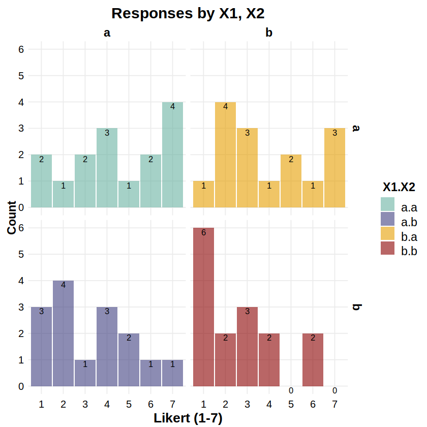
Reporting: “Figure 15a shows the distribution of Likert responses (1-7) for each combination of X1 and X2. An analysis of variance based on ordinal logistic regression indicated a statistically significant effect on Y of X2 (χ2(1, N=60) = 6.14, p < .05), but not of X1 (χ2(1, N=60) = 1.65, n.s.) or of the X1×X2 interaction (χ2(1, N=60) = 0.05, n.s.).”
# Example data
# df has subjects (S), two between-Ss factors (X1,X2) each w/levels (a,b), and polytomous response (Y)
df <- read.csv("data/2F2LBs_ordinal.csv")
head(df, 20)
| S | X1 | X2 | Y | |
|---|---|---|---|---|
| <int> | <chr> | <chr> | <int> | |
| 1 | 1 | a | a | 7 |
| 2 | 2 | a | b | 3 |
| 3 | 3 | b | a | 3 |
| 4 | 4 | b | b | 2 |
| 5 | 5 | a | a | 5 |
| 6 | 6 | a | b | 4 |
| 7 | 7 | b | a | 3 |
| 8 | 8 | b | b | 6 |
| 9 | 9 | a | a | 4 |
| 10 | 10 | a | b | 2 |
| 11 | 11 | b | a | 6 |
| 12 | 12 | b | b | 3 |
| 13 | 13 | a | a | 2 |
| 14 | 14 | a | b | 5 |
| 15 | 15 | b | a | 5 |
| 16 | 16 | b | b | 1 |
| 17 | 17 | a | a | 7 |
| 18 | 18 | a | b | 5 |
| 19 | 19 | b | a | 2 |
| 20 | 20 | b | b | 4 |
library(MASS) # for polr
library(car) # for Anova
df$S = factor(df$S)
df$X1 = factor(df$X1)
df$X2 = factor(df$X2)
df$Y = ordered(df$Y) # ordinal response
contrasts(df$X1) <- "contr.sum"
contrasts(df$X2) <- "contr.sum"
m = polr(Y ~ X1*X2, data=df, Hess=TRUE)
Anova(m, type=3)
| LR Chisq | Df | Pr(>Chisq) | |
|---|---|---|---|
| <dbl> | <dbl> | <dbl> | |
| X1 | 1.65109008 | 1 | 0.19881063 |
| X2 | 6.14122538 | 1 | 0.01320658 |
| X1:X2 | 0.04980176 | 1 | 0.82340859 |
library(ggplot2)
library(ggthemes)
library(scales)
library(plyr)

# Ordinal histograms-as-barplots
# http://www.sthda.com/english/wiki/ggplot2-barplots-quick-start-guide-r-software-and-data-visualization
# https://stackoverflow.com/questions/51892875/how-to-increase-the-space-between-grouped-bars-in-ggplot2
df2 <- as.data.frame(xtabs(~ X1+X2+Y, data=df)) # build a freq table
df2$X12 = with(df2, interaction(X1, X2))
df2$X12 = factor(df2$X12, levels=c("a.a","a.b","b.a","b.b"))
df2 <- df2[order(df2$X1, df2$X2),] # sort df2 alphabetically by X1, X2
ggplot(data=df2, aes(x=Y, y=Freq, fill=X12)) + theme_minimal() +
  # set the font styles for the plot title and axis titles
  theme(plot.title   = element_text(face="bold",  color="black", size=18, hjust=0.5, vjust=0.0, angle=0)) +
  theme(axis.title.x = element_text(face="bold",  color="black", size=16, hjust=0.5, vjust=0.0, angle=0)) +
  theme(axis.title.y = element_text(face="bold",  color="black", size=14, hjust=0.5, vjust=0.0, angle=90)) +
  # set the font styles for the value labels that show on each axis
  theme(axis.text.x  = element_text(face="plain", color="black", size=12, hjust=0.5, vjust=0.0, angle=0)) +
  theme(axis.text.y  = element_text(face="plain", color="black", size=12, hjust=0.0, vjust=0.5, angle=0)) +
  # set the font styles for the legend
  theme(legend.title = element_text(face="bold", color="black", size=14, hjust=0.5, vjust=0.0, angle=0)) +
  theme(legend.text  = element_text(face="plain", color="black", size=14, hjust=0.5, vjust=0.0, angle=0)) +
  # set the font style for the facet labels
  theme(strip.text = element_text(face="bold", color="black", size=14, hjust=0.5)) +
  # use a bar plot to just plot the value for each 1-7 in (X1,X2)
  geom_col(width=0.95, alpha=0.60) +
  #geom_bar(stat="identity", width=0.95, alpha=0.60) + # equivalent
  # place text labels on each bar
  geom_text(aes(label=Freq), vjust=1.2, color="black", size=3.5) +
  # create a grid of plots by (X1,X2), one for each histogram
  #facet_grid(X12 ~ .) +  # 4x1 stack
  #facet_grid(. ~ X12) +  # 1x4 row
  facet_grid(X2 ~ X1) +   # 2x2 grid
  # determine the fill color values of each histogram
  scale_fill_manual(values=c("#69b3a2","#404080", "#e69f00", "darkred")) +
  # set the labels for the title, each axis, and the legend
  labs(title="Responses by X1, X2", x="Likert (1-7)", y="Count") +
  guides(fill=guide_legend(title="X1.X2")) +
  # set the ranges and value labels for each axis
  scale_x_discrete(labels=seq(1,7,by=1)) +
  scale_y_continuous(breaks=seq(0,6,by=1), minor_breaks=seq(0,6,by=1), labels=seq(0,6,by=1), limits=c(0,6))
GLM for Poisson Distribution Data#
Distribution: Poisson
Link: log
Typical Uses: Poisson Regression: counts, rare events (e.g. gesture recognition errors, 3-pointers per quarter, number of “F” grades)
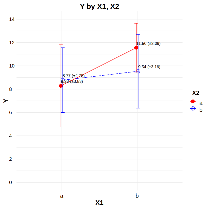
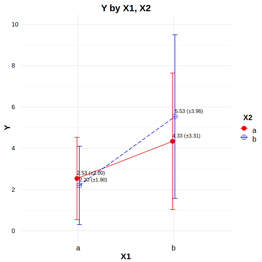
Reporting: “Figure 16a shows an interaction plot with ±1 standard deviation error bars for X1 and X2. An analysis of variance based on Poisson regression indicated a statistically significant effect on Y of the X1×X2 interaction (χ2(1, N=60) = 3.84, p < .05), but not of either X1 (χ2(1, N=60) = 0.17, n.s.) or X2 (χ2(1, N=60) = 1.19, n.s.).”
# Example data
# df has subjects (S), two factors (X1,X2) each w/levels (a,b), and count response (Y)
df <- read.csv("data/2F2LBs_poisson.csv")
head(df, 20)
| S | X1 | X2 | Y | |
|---|---|---|---|---|
| <int> | <chr> | <chr> | <int> | |
| 1 | 1 | a | a | 5 |
| 2 | 2 | a | b | 6 |
| 3 | 3 | b | a | 7 |
| 4 | 4 | b | b | 4 |
| 5 | 5 | a | a | 4 |
| 6 | 6 | a | b | 6 |
| 7 | 7 | b | a | 6 |
| 8 | 8 | b | b | 4 |
| 9 | 9 | a | a | 4 |
| 10 | 10 | a | b | 9 |
| 11 | 11 | b | a | 7 |
| 12 | 12 | b | b | 2 |
| 13 | 13 | a | a | 3 |
| 14 | 14 | a | b | 3 |
| 15 | 15 | b | a | 3 |
| 16 | 16 | b | b | 7 |
| 17 | 17 | a | a | 5 |
| 18 | 18 | a | b | 4 |
| 19 | 19 | b | a | 8 |
| 20 | 20 | b | b | 3 |
library(car) # for Anova
df$S = factor(df$S)
df$X1 = factor(df$X1)
df$X2 = factor(df$X2)
contrasts(df$X1) <- "contr.sum"
contrasts(df$X2) <- "contr.sum"
m = glm(Y ~ X1*X2, data=df, family=poisson)
Anova(m, type=3)
| LR Chisq | Df | Pr(>Chisq) | |
|---|---|---|---|
| <dbl> | <dbl> | <dbl> | |
| X1 | 0.1673829 | 1 | 0.68244826 |
| X2 | 1.1865585 | 1 | 0.27602485 |
| X1:X2 | 3.8423440 | 1 | 0.04997361 |
library(ggplot2)
library(ggthemes)
library(scales)
library(plyr)

# Interaction plot
# http://www.sthda.com/english/wiki/ggplot2-line-plot-quick-start-guide-r-software-and-data-visualization
# http://www.sthda.com/english/wiki/ggplot2-error-bars-quick-start-guide-r-software-and-data-visualization
# http://www.sthda.com/english/wiki/ggplot2-point-shapes
# http://www.sthda.com/english/wiki/ggplot2-line-types-how-to-change-line-types-of-a-graph-in-r-software
df2 <- ddply(df, ~ X1*X2, function(d) # make a summary data table
  c(NROW(d$Y),
    sum(is.na(d$Y)),
    sum(!is.na(d$Y)),
    mean(d$Y, na.rm=TRUE),
    sd(d$Y, na.rm=TRUE),
    median(d$Y, na.rm=TRUE),
    IQR(d$Y, na.rm=TRUE)))
colnames(df2) <- c("X1","X2","Rows","NAs","NotNAs","Mean","SD","Median","IQR")
ggplot(data=df2, aes(x=X1, y=Mean, color=X2, group=X2)) + theme_minimal() +
  # set the font styles for the plot title and axis titles
  theme(plot.title   = element_text(face="bold",  color="black", size=18, hjust=0.5, vjust=0.0, angle=0)) +
  theme(axis.title.x = element_text(face="bold",  color="black", size=16, hjust=0.5, vjust=0.0, angle=0)) +
  theme(axis.title.y = element_text(face="bold",  color="black", size=16, hjust=0.5, vjust=0.0, angle=90)) +
  # set the font styles for the value labels that show on each axis
  theme(axis.text.x  = element_text(face="plain", color="black", size=14, hjust=0.5, vjust=0.0, angle=0)) +
  theme(axis.text.y  = element_text(face="plain", color="black", size=12, hjust=0.0, vjust=0.5, angle=0)) +
  # set the font styles for the legend
  theme(legend.title = element_text(face="bold", color="black", size=14, hjust=0.5, vjust=0.0, angle=0)) +
  theme(legend.text  = element_text(face="plain", color="black", size=14, hjust=0.5, vjust=0.0, angle=0)) +
  # create the plot lines, points, and error bars
  geom_line(aes(linetype=X2), position=position_dodge(0.05)) +
  geom_point(aes(shape=X2, size=X2), position=position_dodge(0.05)) +
  geom_errorbar(aes(ymin=Mean-SD, ymax=Mean+SD), position=position_dodge(0.05), width=0.1) +
  # place text labels on each bar
  geom_text(aes(label=sprintf("%.2f (±%.2f)", Mean, SD)), position=position_dodge(0.05), hjust=0.0, vjust=-1.0, color="black", size=3.5) +
  # set the labels for the title and each axis
  labs(title="Y by X1, X2", x="X1", y="Y") +
  # set the ranges and value labels for each axis
  scale_x_discrete(labels=c("a","b")) +
  scale_y_continuous(breaks=seq(0,7,by=2), labels=seq(0,7,by=2), limits=c(0,7), oob=rescale_none) +
  # set the name, labels, and colors for the traces
  scale_color_manual(name="X2", labels=c("a","b"), values=c("red", "blue")) +
  # set the size and shape of the points
  scale_size_manual(values=c(4,4)) +
  scale_shape_manual(values=c(16,10)) +
  # set the linetype of the lines
  scale_linetype_manual(values=c("solid", "longdash"))
GLM for Zero-Inflated Poisson Distribution Data#
Distribution: Zero-Inflated Poisson
Link: log
Typical Uses: Zero-Inflated Poisson Regression: counts, rare events with large proportion of zeroes
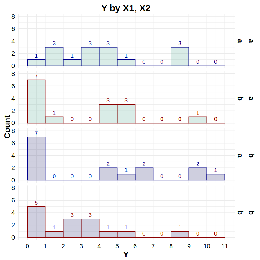
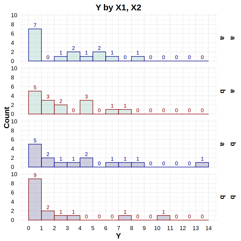
Reporting: “Figure 17a shows histograms of Y by X1 and X2. An analysis of variance based on zero-inflated Poisson regression indicated a statistically significant effect on Y of the X1×X2 interaction (χ2(1, N=60) = 8.14, p < .01), and a marginal effect of X2 (χ2(1, N=60) = 3.11, p = .078). There was no statistically significant effect of X1 on Y (χ2(1, N=60) = 0.29, n.s.).”
# Example data
# df has subjects (S), two factors (X1,X2) each w/levels (a,b), and count response (Y)
df <- read.csv("data/2F2LBs_zipoisson.csv")
head(df, 20)
| S | X1 | X2 | Y | |
|---|---|---|---|---|
| <int> | <chr> | <chr> | <int> | |
| 1 | 1 | a | a | 1 |
| 2 | 2 | a | b | 0 |
| 3 | 3 | b | a | 0 |
| 4 | 4 | b | b | 2 |
| 5 | 5 | a | a | 1 |
| 6 | 6 | a | b | 5 |
| 7 | 7 | b | a | 6 |
| 8 | 8 | b | b | 5 |
| 9 | 9 | a | a | 1 |
| 10 | 10 | a | b | 0 |
| 11 | 11 | b | a | 0 |
| 12 | 12 | b | b | 8 |
| 13 | 13 | a | a | 4 |
| 14 | 14 | a | b | 1 |
| 15 | 15 | b | a | 0 |
| 16 | 16 | b | b | 0 |
| 17 | 17 | a | a | 8 |
| 18 | 18 | a | b | 5 |
| 19 | 19 | b | a | 5 |
| 20 | 20 | b | b | 3 |
library(pscl) # for zeroinfl
library(car) # for Anova
df$S = factor(df$S)
df$X1 = factor(df$X1)
df$X2 = factor(df$X2)
contrasts(df$X1) <- "contr.sum"
contrasts(df$X2) <- "contr.sum"
m = zeroinfl(Y ~ X1*X2, data=df, dist="poisson")
Anova(m, type=3)
Classes and Methods for R developed in the
Political Science Computational Laboratory
Department of Political Science
Stanford University
Simon Jackman
hurdle and zeroinfl functions by Achim Zeileis
| Df | Chisq | Pr(>Chisq) | |
|---|---|---|---|
| <dbl> | <dbl> | <dbl> | |
| X1 | 1 | 0.2896065 | 0.590472795 |
| X2 | 1 | 3.1082855 | 0.077894917 |
| X1:X2 | 1 | 8.1401657 | 0.004329533 |
library(ggplot2)
library(ggthemes)
library(scales)
library(plyr)

# Histograms
# http://www.sthda.com/english/wiki/ggplot2-histogram-plot-quick-start-guide-r-software-and-data-visualization
ggplot(data=df, aes(x=Y, fill=X1, color=X2)) + theme_minimal() +
  # set the font styles for the plot title and axis titles
  theme(plot.title   = element_text(face="bold",  color="black", size=18, hjust=0.5, vjust=0.0, angle=0)) +
  theme(axis.title.x = element_text(face="bold",  color="black", size=16, hjust=0.5, vjust=0.0, angle=0)) +
  theme(axis.title.y = element_text(face="bold",  color="black", size=16, hjust=0.5, vjust=0.0, angle=90)) +
  # set the font styles for the value labels that show on each axis
  theme(axis.text.x  = element_text(face="plain", color="black", size=12, hjust=0.5, vjust=0.0, angle=0)) +
  theme(axis.text.y  = element_text(face="plain", color="black", size=12, hjust=0.0, vjust=0.5, angle=0)) +
  # set the font style for the facet labels
  theme(strip.text = element_text(face="bold", color="black", size=14, hjust=0.5)) +
  # remove the legend
  theme(legend.position="none") +
  # create the histogram; the alpha value ensures overlaps can be seen
  geom_histogram(binwidth=1, breaks=seq(-0.5,10.5,by=1), alpha=0.25) +
  stat_bin(aes(y=..count.., label=..count..), binwidth=1, geom="text", vjust=-0.5) +
  # create stacked plots by X, one for each histogram
  facet_grid(X1+X2 ~ .) +
  # determine the outline and fill color values of each histogram
  scale_color_manual(values=c("darkblue","darkred")) +
  scale_fill_manual(values=c("#69b3a2","#404080")) +
  # set the labels for the title and each axis
  labs(title="Y by X1, X2", x="Y", y="Count") +
  # set the ranges and value labels for each axis
  scale_x_continuous(breaks=seq(-0.5,10.5,by=1), labels=seq(0,11,by=1), limits=c(-0.5,10.5)) +
  scale_y_continuous(breaks=seq(0,8,by=2), labels=seq(0,8,by=2), limits=c(0,8))
Warning message:
“The dot-dot notation (`..count..`) was deprecated in ggplot2 3.4.0.
ℹ Please use `after_stat(count)` instead.”
GLM for Negative Binomial Distribution Data#
Distribution: Negative Binomial
Link: log
Typical Uses: Negative Binomial Regression: Same as Poisson but for use in the presence of overdispersion
Reporting: “Figure 18a shows an interaction plot with ±1 standard deviation error bars for X1 and X2. An analysis of variance based on negative binomial regression indicated a statistically significant effect on Y of X1 (χ2(1, N=60) = 13.46, p < .001), but not of X2 (χ2(1, N=60) = 0.07, n.s.) or the X1×X2 interaction (χ2(1, N=60) = 0.92, n.s.).”
# Example data
# df has subjects (S), two factors (X1,X2) each w/levels (a,b), and count response (Y)
df <- read.csv("data/2F2LBs_negbin.csv")
head(df, 20)
| S | X1 | X2 | Y | |
|---|---|---|---|---|
| <int> | <chr> | <chr> | <int> | |
| 1 | 1 | a | a | 1 |
| 2 | 2 | a | b | 1 |
| 3 | 3 | b | a | 2 |
| 4 | 4 | b | b | 9 |
| 5 | 5 | a | a | 0 |
| 6 | 6 | a | b | 1 |
| 7 | 7 | b | a | 1 |
| 8 | 8 | b | b | 7 |
| 9 | 9 | a | a | 2 |
| 10 | 10 | a | b | 2 |
| 11 | 11 | b | a | 6 |
| 12 | 12 | b | b | 1 |
| 13 | 13 | a | a | 2 |
| 14 | 14 | a | b | 3 |
| 15 | 15 | b | a | 3 |
| 16 | 16 | b | b | 1 |
| 17 | 17 | a | a | 2 |
| 18 | 18 | a | b | 3 |
| 19 | 19 | b | a | 10 |
| 20 | 20 | b | b | 4 |
library(MASS) # for glm.nb
library(car) # for Anova
df$S = factor(df$S)
df$X1 = factor(df$X1)
df$X2 = factor(df$X2)
contrasts(df$X1) <- "contr.sum"
contrasts(df$X2) <- "contr.sum"
m = glm.nb(Y ~ X1*X2, data=df)
Anova(m, type=3)
| LR Chisq | Df | Pr(>Chisq) | |
|---|---|---|---|
| <dbl> | <dbl> | <dbl> | |
| X1 | 13.4596339 | 1 | 0.0002437513 |
| X2 | 0.0663977 | 1 | 0.7966558091 |
| X1:X2 | 0.9247341 | 1 | 0.3362350241 |
library(ggplot2)
library(ggthemes)
library(scales)
library(plyr)

# Interaction plot
# http://www.sthda.com/english/wiki/ggplot2-line-plot-quick-start-guide-r-software-and-data-visualization
# http://www.sthda.com/english/wiki/ggplot2-error-bars-quick-start-guide-r-software-and-data-visualization
# http://www.sthda.com/english/wiki/ggplot2-point-shapes
# http://www.sthda.com/english/wiki/ggplot2-line-types-how-to-change-line-types-of-a-graph-in-r-software
df2 <- ddply(df, ~ X1*X2, function(d) # make a summary data table
  c(NROW(d$Y),
    sum(is.na(d$Y)),
    sum(!is.na(d$Y)),
    mean(d$Y, na.rm=TRUE),
    sd(d$Y, na.rm=TRUE),
    median(d$Y, na.rm=TRUE),
    IQR(d$Y, na.rm=TRUE)))
colnames(df2) <- c("X1","X2","Rows","NAs","NotNAs","Mean","SD","Median","IQR")
ggplot(data=df2, aes(x=X1, y=Mean, color=X2, group=X2)) + theme_minimal() +
  # set the font styles for the plot title and axis titles
  theme(plot.title   = element_text(face="bold",  color="black", size=18, hjust=0.5, vjust=0.0, angle=0)) +
  theme(axis.title.x = element_text(face="bold",  color="black", size=16, hjust=0.5, vjust=0.0, angle=0)) +
  theme(axis.title.y = element_text(face="bold",  color="black", size=16, hjust=0.5, vjust=0.0, angle=90)) +
  # set the font styles for the value labels that show on each axis
  theme(axis.text.x  = element_text(face="plain", color="black", size=14, hjust=0.5, vjust=0.0, angle=0)) +
  theme(axis.text.y  = element_text(face="plain", color="black", size=12, hjust=0.0, vjust=0.5, angle=0)) +
  # set the font styles for the legend
  theme(legend.title = element_text(face="bold", color="black", size=14, hjust=0.5, vjust=0.0, angle=0)) +
  theme(legend.text  = element_text(face="plain", color="black", size=14, hjust=0.5, vjust=0.0, angle=0)) +
  # create the plot lines, points, and error bars
  geom_line(aes(linetype=X2), position=position_dodge(0.05)) +
  geom_point(aes(shape=X2, size=X2), position=position_dodge(0.05)) +
  geom_errorbar(aes(ymin=Mean-SD, ymax=Mean+SD), position=position_dodge(0.05), width=0.1) +
  # place text labels on each bar
  geom_text(aes(label=sprintf("%.2f (±%.2f)", Mean, SD)), position=position_dodge(0.05), hjust=0.0, vjust=-1.0, color="black", size=3.5) +
  # set the labels for the title and each axis
  labs(title="Y by X1, X2", x="X1", y="Y") +
  # set the ranges and value labels for each axis
  scale_x_discrete(labels=c("a","b")) +
  scale_y_continuous(breaks=seq(0,10,by=2), labels=seq(0,10,by=2), limits=c(0,10), oob=rescale_none) +
  # set the name, labels, and colors for the traces
  scale_color_manual(name="X2", labels=c("a","b"), values=c("red", "blue")) +
  # set the size and shape of the points
  scale_size_manual(values=c(4,4)) +
  scale_shape_manual(values=c(16,10)) +
  # set the linetype of the lines
  scale_linetype_manual(values=c("solid", "longdash"))
GLM for Zero-Inflated Negative Binomial Distribution Data#
Distribution: Zero-Inflated Negative Binomial
Link: log
Typical Uses: Zero-Inflated Negative Binomial Regression: Same as Zero-Inflated Poisson but for use in the presence of overdispersion
Reporting: “Figure 19a shows histograms of Y by X1 and X2. An analysis of variance based on zero-inflated negative binomial regression indicated no statistically significant effects on Y of X1 (χ2(1, N=60) = 0.43, n.s.), X2 (χ2(1, N=60) = 1.28, n.s.), or the X1×X2 interaction (χ2(1, N=60) = 0.10, n.s.).”
# Example data
# df has subjects (S), two between-Ss factors (X1,X2) each w/levels (a,b), and count response (Y)
df <- read.csv("data/2F2LBs_zinegbin.csv")
head(df, 20)
| S | X1 | X2 | Y | |
|---|---|---|---|---|
| <int> | <chr> | <chr> | <int> | |
| 1 | 1 | a | a | 3 |
| 2 | 2 | a | b | 1 |
| 3 | 3 | b | a | 13 |
| 4 | 4 | b | b | 0 |
| 5 | 5 | a | a | 0 |
| 6 | 6 | a | b | 1 |
| 7 | 7 | b | a | 0 |
| 8 | 8 | b | b | 2 |
| 9 | 9 | a | a | 0 |
| 10 | 10 | a | b | 6 |
| 11 | 11 | b | a | 0 |
| 12 | 12 | b | b | 0 |
| 13 | 13 | a | a | 0 |
| 14 | 14 | a | b | 0 |
| 15 | 15 | b | a | 2 |
| 16 | 16 | b | b | 0 |
| 17 | 17 | a | a | 4 |
| 18 | 18 | a | b | 4 |
| 19 | 19 | b | a | 7 |
| 20 | 20 | b | b | 0 |
library(pscl) # for zeroinfl
library(car) # for Anova
df$S = factor(df$S)
df$X1 = factor(df$X1)
df$X2 = factor(df$X2)
contrasts(df$X1) <- "contr.sum"
contrasts(df$X2) <- "contr.sum"
m = zeroinfl(Y ~ X1*X2, data=df, dist="negbin")
Anova(m, type=3)
| Df | Chisq | Pr(>Chisq) | |
|---|---|---|---|
| <dbl> | <dbl> | <dbl> | |
| X1 | 1 | 0.42588152 | 0.5140168 |
| X2 | 1 | 1.28178400 | 0.2575676 |
| X1:X2 | 1 | 0.09911078 | 0.7528994 |
library(ggplot2)
library(ggthemes)
library(scales)
library(plyr)

# Histograms
# http://www.sthda.com/english/wiki/ggplot2-histogram-plot-quick-start-guide-r-software-and-data-visualization
ggplot(data=df, aes(x=Y, fill=X1, color=X2)) + theme_minimal() +
  # set the font styles for the plot title and axis titles
  theme(plot.title   = element_text(face="bold",  color="black", size=18, hjust=0.5, vjust=0.0, angle=0)) +
  theme(axis.title.x = element_text(face="bold",  color="black", size=16, hjust=0.5, vjust=0.0, angle=0)) +
  theme(axis.title.y = element_text(face="bold",  color="black", size=16, hjust=0.5, vjust=0.0, angle=90)) +
  # set the font styles for the value labels that show on each axis
  theme(axis.text.x  = element_text(face="plain", color="black", size=12, hjust=0.5, vjust=0.0, angle=0)) +
  theme(axis.text.y  = element_text(face="plain", color="black", size=12, hjust=0.0, vjust=0.5, angle=0)) +
  # set the font style for the facet labels
  theme(strip.text = element_text(face="bold", color="black", size=14, hjust=0.5)) +
  # remove the legend
  theme(legend.position="none") +
  # create the histogram; the alpha value ensures overlaps can be seen
  geom_histogram(binwidth=1, breaks=seq(-0.5,13.5,by=1), alpha=0.25) +
  stat_bin(aes(y=..count.., label=..count..), binwidth=1, geom="text", vjust=-0.5) +
  # create stacked plots by X, one for each histogram
  facet_grid(X1+X2 ~ .) +
  # determine the outline and fill color values of each histogram
  scale_color_manual(values=c("darkblue","darkred")) +
  scale_fill_manual(values=c("#69b3a2","#404080")) +
  # set the labels for the title and each axis
  labs(title="Y by X1, X2", x="Y", y="Count") +
  # set the ranges and value labels for each axis
  scale_x_continuous(breaks=seq(-0.5,13.5,by=1), labels=seq(0,14,by=1), limits=c(-0.5,13.5)) +
  scale_y_continuous(breaks=seq(0,10,by=2), labels=seq(0,10,by=2), limits=c(0,10))
GLM for Gamma and Expontential Distribution Data#
Distribution: Gamma and Exponential
Link: inverse or log when 1/0 is undefined
Typical Uses: Gamma Regression: Exponentially distributed responses (e.g. income, wait times)
Reporting: “Figure 20a shows an interaction plot with ±1 standard deviation error bars for X1 and X2. An analysis of variance based on Gamma regression indicated no statistically significant effect on Y of X1 (χ2(1, N=60) = 0.40, n.s.) or X2 (χ2(1, N=60) = 0.58, n.s.), but the X1×X2 interaction was marginal (χ2(1, N=60) = 3.26, p = .071).”
# Example data
# df has subjects (S), two factors (X1,X2) each w/levels (a,b), and continuous response (Y)
df <- read.csv("data/2F2LBs_gamma.csv")
head(df, 20)
| S | X1 | X2 | Y | |
|---|---|---|---|---|
| <int> | <chr> | <chr> | <dbl> | |
| 1 | 1 | a | a | 7.210222 |
| 2 | 2 | a | b | 4.511329 |
| 3 | 3 | b | a | 8.750533 |
| 4 | 4 | b | b | 4.636170 |
| 5 | 5 | a | a | 5.059694 |
| 6 | 6 | a | b | 3.906251 |
| 7 | 7 | b | a | 4.144064 |
| 8 | 8 | b | b | 2.890245 |
| 9 | 9 | a | a | 11.229607 |
| 10 | 10 | a | b | 5.079605 |
| 11 | 11 | b | a | 4.408323 |
| 12 | 12 | b | b | 9.266559 |
| 13 | 13 | a | a | 3.851376 |
| 14 | 14 | a | b | 6.323390 |
| 15 | 15 | b | a | 3.870606 |
| 16 | 16 | b | b | 3.884600 |
| 17 | 17 | a | a | 4.155613 |
| 18 | 18 | a | b | 3.056740 |
| 19 | 19 | b | a | 6.283452 |
| 20 | 20 | b | b | 3.060357 |
library(car) # for Anova
df$S = factor(df$S)
df$X1 = factor(df$X1)
df$X2 = factor(df$X2)
contrasts(df$X1) <- "contr.sum"
contrasts(df$X2) <- "contr.sum"
m = glm(Y ~ X1*X2, data=df, family=Gamma)
# family=Gamma(link="log") is often used
Anova(m, type=3)
| LR Chisq | Df | Pr(>Chisq) | |
|---|---|---|---|
| <dbl> | <dbl> | <dbl> | |
| X1 | 0.3971864 | 1 | 0.52854588 |
| X2 | 0.5791674 | 1 | 0.44663887 |
| X1:X2 | 3.2574933 | 1 | 0.07109773 |
library(ggplot2)
library(ggthemes)
library(scales)
library(plyr)

# Interaction plot
# http://www.sthda.com/english/wiki/ggplot2-line-plot-quick-start-guide-r-software-and-data-visualization
# http://www.sthda.com/english/wiki/ggplot2-error-bars-quick-start-guide-r-software-and-data-visualization
# http://www.sthda.com/english/wiki/ggplot2-point-shapes
# http://www.sthda.com/english/wiki/ggplot2-line-types-how-to-change-line-types-of-a-graph-in-r-software
df2 <- ddply(df, ~ X1*X2, function(d) # make a summary data table
  c(NROW(d$Y),
    sum(is.na(d$Y)),
    sum(!is.na(d$Y)),
    mean(d$Y, na.rm=TRUE),
    sd(d$Y, na.rm=TRUE),
    median(d$Y, na.rm=TRUE),
    IQR(d$Y, na.rm=TRUE)))
colnames(df2) <- c("X1","X2","Rows","NAs","NotNAs","Mean","SD","Median","IQR")
ggplot(data=df2, aes(x=X1, y=Mean, color=X2, group=X2)) + theme_minimal() +
  # set the font styles for the plot title and axis titles
  theme(plot.title   = element_text(face="bold",  color="black", size=18, hjust=0.5, vjust=0.0, angle=0)) +
  theme(axis.title.x = element_text(face="bold",  color="black", size=16, hjust=0.5, vjust=0.0, angle=0)) +
  theme(axis.title.y = element_text(face="bold",  color="black", size=16, hjust=0.5, vjust=0.0, angle=90)) +
  # set the font styles for the value labels that show on each axis
  theme(axis.text.x  = element_text(face="plain", color="black", size=14, hjust=0.5, vjust=0.0, angle=0)) +
  theme(axis.text.y  = element_text(face="plain", color="black", size=12, hjust=0.0, vjust=0.5, angle=0)) +
  # set the font styles for the legend
  theme(legend.title = element_text(face="bold", color="black", size=14, hjust=0.5, vjust=0.0, angle=0)) +
  theme(legend.text  = element_text(face="plain", color="black", size=14, hjust=0.5, vjust=0.0, angle=0)) +
  # create the plot lines, points, and error bars
  geom_line(aes(linetype=X2), position=position_dodge(0.05)) +
  geom_point(aes(shape=X2, size=X2), position=position_dodge(0.05)) +
  geom_errorbar(aes(ymin=Mean-SD, ymax=Mean+SD), position=position_dodge(0.05), width=0.1) +
  # place text labels on each bar
  geom_text(aes(label=sprintf("%.2f (±%.2f)", Mean, SD)), position=position_dodge(0.05), hjust=0.0, vjust=-1.0, color="black", size=3.5) +
  # set the labels for the title and each axis
  labs(title="Y by X1, X2", x="X1", y="Y") +
  # set the ranges and value labels for each axis
  scale_x_discrete(labels=c("a","b")) +
  scale_y_continuous(breaks=seq(0,9,by=2), labels=seq(0,9,by=2), limits=c(0,9), oob=rescale_none) +
  # set the name, labels, and colors for the traces
  scale_color_manual(name="X2", labels=c("a","b"), values=c("red", "blue")) +
  # set the size and shape of the points
  scale_size_manual(values=c(4,4)) +
  scale_shape_manual(values=c(16,10)) +
  # set the linetype of the lines
  scale_linetype_manual(values=c("solid", "longdash"))