Distributions - R
Contents
Distributions - R#
Normal Distribution#
Parameterization: mean (μ):
mean, standard deviation (σ):sdDistribution Functions:
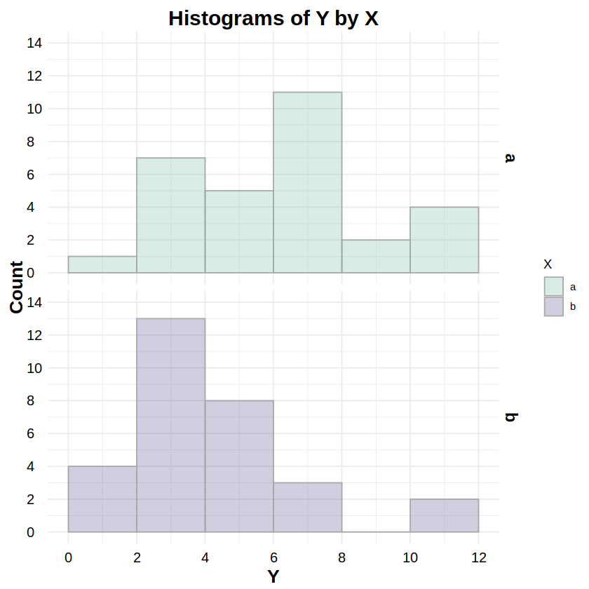
_norm:dnorm,pnorm,qnorm,rnormReporting: “Figure 2 shows the distributions of response Y for both levels of factor X. To test whether these distributions were normally distributed, a Kolmogorov-Smirnov test was run on Y for both levels of X. The test for level ‘a’ was statistically non-significant (D = .158, p = .404), as was the test for level ‘b’ (D = .104, p = .867), indicating non-detectable deviations from a normal distribution for both levels.”
# Example data
# df has one factor (X) w/two levels (a,b) and continuous response Y
df <- read.csv("data/1F2LBs_normal.csv")
head(df, 20)
| S | X | Y | |
|---|---|---|---|
| <int> | <chr> | <dbl> | |
| 1 | 1 | a | 10.055297 |
| 2 | 2 | b | 11.462669 |
| 3 | 3 | a | 12.140244 |
| 4 | 4 | b | 14.025322 |
| 5 | 5 | a | 6.922079 |
| 6 | 6 | b | 16.523659 |
| 7 | 7 | a | 7.350582 |
| 8 | 8 | b | 13.416170 |
| 9 | 9 | a | 11.279275 |
| 10 | 10 | b | 12.571377 |
| 11 | 11 | a | 12.216500 |
| 12 | 12 | b | 12.017293 |
| 13 | 13 | a | 10.485682 |
| 14 | 14 | b | 14.422881 |
| 15 | 15 | a | 12.127070 |
| 16 | 16 | b | 16.750440 |
| 17 | 17 | a | 8.874990 |
| 18 | 18 | b | 11.498568 |
| 19 | 19 | a | 11.509413 |
| 20 | 20 | b | 13.603714 |
library(MASS) # for fitdistr
fa = fitdistr(df[df$X == "a",]$Y, "normal")$estimate # create fit for X.a
ks.test(df[df$X == "a",]$Y, "pnorm", mean=fa[1], sd=fa[2])
fb = fitdistr(df[df$X == "b",]$Y, "normal")$estimate # create fit for X.b
ks.test(df[df$X == "b",]$Y, "pnorm", mean=fb[1], sd=fb[2])
	Exact one-sample Kolmogorov-Smirnov test

data:  df[df$X == "a", ]$Y
D = 0.15752, p-value = 0.4042
alternative hypothesis: two-sided
	Exact one-sample Kolmogorov-Smirnov test

data:  df[df$X == "b", ]$Y
D = 0.10418, p-value = 0.8674
alternative hypothesis: two-sided
library(ggplot2)
library(ggthemes)
library(scales)

# Histograms
# http://www.sthda.com/english/wiki/ggplot2-histogram-plot-quick-start-guide-r-software-and-data-visualization
ggplot(data=df, aes(x=Y, col=X, fill=X)) + theme_minimal() +
  # set the font styles for the plot title and axis titles
  theme(plot.title   = element_text(face="bold",  color="black", size=18, hjust=0.5, vjust=0.0, angle=0)) +
  theme(axis.title.x = element_text(face="bold",  color="black", size=16, hjust=0.5, vjust=0.0, angle=0)) +
  theme(axis.title.y = element_text(face="bold",  color="black", size=16, hjust=0.5, vjust=0.0, angle=90)) +
  # set the font styles for the value labels that show on each axis
  theme(axis.text.x  = element_text(face="plain", color="black", size=12, hjust=0.5, vjust=0.0, angle=0)) +
  theme(axis.text.y  = element_text(face="plain", color="black", size=12, hjust=0.0, vjust=0.5, angle=0)) +
  # set the font style for the facet labels
  theme(strip.text = element_text(face="bold", color="black", size=14, hjust=0.5)) +
  # create the histogram; the alpha value ensures overlaps can be seen
  geom_histogram(color="darkgray", binwidth=1, breaks=seq(4,18,by=1), alpha=0.25, position="identity") +
  # create stacked plots by X, one for each histogram
  facet_grid(X ~ .) +
  # determine the fill color values of each histogram
  scale_fill_manual(values=c("#69b3a2","#404080")) +
  # set the labels for the title and each axis
  labs(title="Histograms of Y by X", x="Y", y="Count") +
  # set the ranges and value labels for each axis
  scale_x_continuous(breaks=seq(4,18,by=1), labels=seq(4,18,by=1), limits=c(4,18)) +
  scale_y_continuous(breaks=seq(0,8,by=2), labels=seq(0,8,by=2), limits=c(0,8))
Lognormal Distribution#
Parameterization: mean (μ):
meanlog, standard deviation (σ):sdlogDistribution Functions:
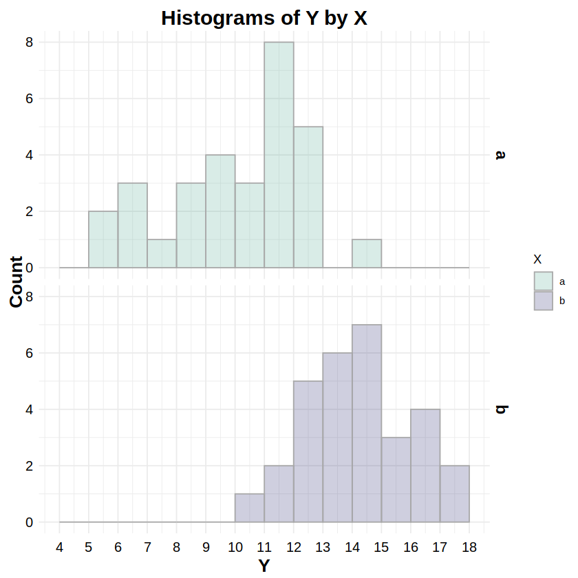
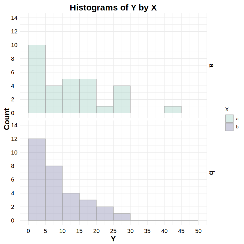
_lnorm:dlnorm,plnorm,qlnorm,rlnormReporting: “Figure 3 shows the distributions of response Y for both levels of factor X. To test whether these distributions were lognormally distributed, a Kolmogorov-Smirnov test was run on Y for both levels of X. The test for level ‘a’ was statistically non-significant (D = .096, p = .918), as was the test for level ‘b’ (D = .161, p = .375), indicating non-detectable deviations from a lognormal distribution for both levels.”
# Example data
# df has one factor (X) w/two levels (a,b) and continuous response Y
df <- read.csv("data/1F2LBs_lognormal.csv")
head(df, 20)
| S | X | Y | |
|---|---|---|---|
| <int> | <chr> | <dbl> | |
| 1 | 1 | a | 18.308269 |
| 2 | 2 | b | 5.951342 |
| 3 | 3 | a | 5.739954 |
| 4 | 4 | b | 5.932270 |
| 5 | 5 | a | 21.378222 |
| 6 | 6 | b | 25.155509 |
| 7 | 7 | a | 20.848274 |
| 8 | 8 | b | 6.533354 |
| 9 | 9 | a | 8.683973 |
| 10 | 10 | b | 11.213393 |
| 11 | 11 | a | 6.517906 |
| 12 | 12 | b | 19.214861 |
| 13 | 13 | a | 1.084347 |
| 14 | 14 | b | 11.620167 |
| 15 | 15 | a | 1.334683 |
| 16 | 16 | b | 12.304836 |
| 17 | 17 | a | 14.400186 |
| 18 | 18 | b | 18.914468 |
| 19 | 19 | a | 3.369996 |
| 20 | 20 | b | 5.535679 |
library(MASS) # for fitdistr
fa = fitdistr(df[df$X == "a",]$Y, "lognormal")$estimate # create fit for X.a
ks.test(df[df$X == "a",]$Y, "plnorm", meanlog=fa[1], sdlog=fa[2])
fb = fitdistr(df[df$X == "b",]$Y, "lognormal")$estimate # create fit for X.b
ks.test(df[df$X == "b",]$Y, "plnorm", meanlog=fb[1], sdlog=fb[2])
	Exact one-sample Kolmogorov-Smirnov test

data:  df[df$X == "a", ]$Y
D = 0.0964, p-value = 0.918
alternative hypothesis: two-sided
	Exact one-sample Kolmogorov-Smirnov test

data:  df[df$X == "b", ]$Y
D = 0.16135, p-value = 0.3752
alternative hypothesis: two-sided
library(ggplot2)
library(ggthemes)
library(scales)

# Plot lognormal histograms
# http://www.sthda.com/english/wiki/ggplot2-histogram-plot-quick-start-guide-r-software-and-data-visualization
ggplot(data=df, aes(x=Y, col=X, fill=X)) + theme_minimal() +
  # set the font styles for the plot title and axis titles
  theme(plot.title   = element_text(face="bold",  color="black", size=18, hjust=0.5, vjust=0.0, angle=0)) +
  theme(axis.title.x = element_text(face="bold",  color="black", size=16, hjust=0.5, vjust=0.0, angle=0)) +
  theme(axis.title.y = element_text(face="bold",  color="black", size=16, hjust=0.5, vjust=0.0, angle=90)) +
  # set the font styles for the value labels that show on each axis
  theme(axis.text.x  = element_text(face="plain", color="black", size=12, hjust=0.5, vjust=0.0, angle=0)) +
  theme(axis.text.y  = element_text(face="plain", color="black", size=12, hjust=0.0, vjust=0.5, angle=0)) +
  # set the font style for the facet labels
  theme(strip.text = element_text(face="bold", color="black", size=14, hjust=0.5)) +
  # create the histogram; the alpha value ensures overlaps can be seen
  geom_histogram(color="darkgray", binwidth=10, breaks=seq(0,80,by=10), alpha=0.25, position="identity") +
  # create stacked plots by X, one for each histogram
  facet_grid(X ~ .) +
  # determine the fill color values of each histogram
  scale_fill_manual(values=c("#69b3a2","#404080")) +
  # set the labels for the title and each axis
  labs(title="Histograms of Y by X", x="Y", y="Count") +
  # set the ranges and value labels for each axis
  scale_x_continuous(breaks=seq(0,80,by=10), labels=seq(0,80,by=10), limits=c(0,80)) +
  scale_y_continuous(breaks=seq(0,20,by=4), labels=seq(0,20,by=4), limits=c(0,20))
Poisson Distribution#
Parameterization: lambda (λ):
lambdaDistribution Functions:
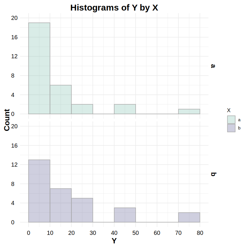
_pois:dpois,ppois,qpois,rpoisReporting: “Figure 4 shows the distributions of response Y for both levels of factor X. To test whether these distributionswere Poisson distributed, a Chi-Squared goodness-of-fit test was run on Y for both levels of X. The test for level ‘a’ was statistically non-significant (χ2(3, N=30) = 2.62, p = .454), as was the test for level ‘b’ (χ2(4, N=30) = 2.79, p = .593), indicating non-detectable deviations from a Poisson distribution for both levels.”
# Example data
# df has one factor (X) w/two levels (a,b) and nonnegative integer response Y
df <- read.csv("data/1F2LBs_poisson.csv")
head(df, 20)
| S | X | Y | |
|---|---|---|---|
| <int> | <chr> | <int> | |
| 1 | 1 | a | 5 |
| 2 | 2 | b | 6 |
| 3 | 3 | a | 3 |
| 4 | 4 | b | 3 |
| 5 | 5 | a | 3 |
| 6 | 6 | b | 5 |
| 7 | 7 | a | 5 |
| 8 | 8 | b | 7 |
| 9 | 9 | a | 2 |
| 10 | 10 | b | 4 |
| 11 | 11 | a | 2 |
| 12 | 12 | b | 5 |
| 13 | 13 | a | 0 |
| 14 | 14 | b | 5 |
| 15 | 15 | a | 0 |
| 16 | 16 | b | 6 |
| 17 | 17 | a | 2 |
| 18 | 18 | b | 3 |
| 19 | 19 | a | 4 |
| 20 | 20 | b | 6 |
library(fitdistrplus) # for fitdist, gofstat
fa = fitdist(df[df$X == "a",]$Y, "pois") # create fit for X.a
gofstat(fa)
fb = fitdist(df[df$X == "b",]$Y, "pois") # create fit for X.b
gofstat(fb)
Loading required package: survival
Chi-squared statistic:  2.619401
Degree of freedom of the Chi-squared distribution:  3
Chi-squared p-value:  0.4540985
   the p-value may be wrong with some theoretical counts < 5
Chi-squared table:
     obscounts theocounts
<= 1  5.000000   7.280252
<= 2 10.000000   7.284586
<= 3  5.000000   6.637067
<= 4  6.000000   4.535329
> 4   4.000000   4.262765

Goodness-of-fit criteria
                               1-mle-pois
Akaike's Information Criterion   112.8951
Bayesian Information Criterion   114.2962
Chi-squared statistic:  2.794443
Degree of freedom of the Chi-squared distribution:  4
Chi-squared p-value:  0.5927924
   the p-value may be wrong with some theoretical counts < 5
Chi-squared table:
     obscounts theocounts
<= 2  4.000000   5.436500
<= 3  6.000000   5.173554
<= 4  5.000000   5.734022
<= 5  6.000000   5.084166
<= 6  6.000000   3.756634
> 6   3.000000   4.815124

Goodness-of-fit criteria
                               1-mle-pois
Akaike's Information Criterion   121.0369
Bayesian Information Criterion   122.4381
library(ggplot2)
library(ggthemes)
library(scales)

# Plot Poisson histograms
# http://www.sthda.com/english/wiki/ggplot2-histogram-plot-quick-start-guide-r-software-and-data-visualization
ggplot(data=df, aes(x=Y, col=X, fill=X)) + theme_minimal() +
  # set the font styles for the plot title and axis titles
  theme(plot.title   = element_text(face="bold",  color="black", size=18, hjust=0.5, vjust=0.0, angle=0)) +
  theme(axis.title.x = element_text(face="bold",  color="black", size=16, hjust=0.5, vjust=0.0, angle=0)) +
  theme(axis.title.y = element_text(face="bold",  color="black", size=16, hjust=0.5, vjust=0.0, angle=90)) +
  # set the font styles for the value labels that show on each axis
  theme(axis.text.x  = element_text(face="plain", color="black", size=12, hjust=0.5, vjust=0.0, angle=0)) +
  theme(axis.text.y  = element_text(face="plain", color="black", size=12, hjust=0.0, vjust=0.5, angle=0)) +
  # set the font style for the facet labels
  theme(strip.text = element_text(face="bold", color="black", size=14, hjust=0.5)) +
  # create the histogram; the alpha value ensures overlaps can be seen
  geom_histogram(color="darkgray", binwidth=1, breaks=seq(0,8,by=1), alpha=0.25, position="identity") +
  # create stacked plots by X, one for each histogram
  facet_grid(X ~ .) +
  # determine the fill color values of each histogram
  scale_fill_manual(values=c("#69b3a2","#404080")) +
  # set the labels for the title and each axis
  labs(title="Histograms of Y by X", x="Y", y="Count") +
  # set the ranges and value labels for each axis
  scale_x_continuous(breaks=seq(0,8,by=1), labels=seq(0,8,by=1), limits=c(0,8)) +
  scale_y_continuous(breaks=seq(0,10,by=2), labels=seq(0,10,by=2), limits=c(0,10))
Negative Binomial Distribution#
Parameterization: theta (θ):
theta, mu (μ):muDistribution Functions:
_nbinom:dnbinom,pnbinom,qnbinom,rnbinomReporting: “Figure 5 shows the distributions of response Y for both levels of factor X. To test whether these distributions were negative binomially distributed, a Chi-Squared goodness-of-fit test was run on Y for both levels of X. The test for level ‘a’ was statistically non-significant (χ2(4, N=30) = 1.74, p = .783), as was the test for level ‘b’ (χ2(3, N=30) = 1.27, p = .737), indicating non-detectable deviations from a negative binomial distribution for both levels.”
# Example data
# df has one factor (X) w/two levels (a,b) and nonnegative integer response Y
df <- read.csv("data/1F2LBs_negbin.csv")
head(df, 20)
| S | X | Y | |
|---|---|---|---|
| <int> | <chr> | <int> | |
| 1 | 1 | a | 22 |
| 2 | 2 | b | 11 |
| 3 | 3 | a | 16 |
| 4 | 4 | b | 9 |
| 5 | 5 | a | 8 |
| 6 | 6 | b | 16 |
| 7 | 7 | a | 13 |
| 8 | 8 | b | 4 |
| 9 | 9 | a | 18 |
| 10 | 10 | b | 10 |
| 11 | 11 | a | 15 |
| 12 | 12 | b | 6 |
| 13 | 13 | a | 27 |
| 14 | 14 | b | 19 |
| 15 | 15 | a | 15 |
| 16 | 16 | b | 14 |
| 17 | 17 | a | 22 |
| 18 | 18 | b | 20 |
| 19 | 19 | a | 36 |
| 20 | 20 | b | 10 |
library(fitdistrplus) # for fitdist, gofstat
fa = fitdist(df[df$X == "a",]$Y, "nbinom") # create fit for X.a
gofstat(fa)
fb = fitdist(df[df$X == "b",]$Y, "nbinom") # create fit for X.b
gofstat(fb)
Chi-squared statistic:  1.73975
Degree of freedom of the Chi-squared distribution:  4
Chi-squared p-value:  0.7834849
   the p-value may be wrong with some theoretical counts < 5
Chi-squared table:
      obscounts theocounts
<= 7   5.000000   3.498637
<= 11  4.000000   5.021527
<= 14  5.000000   4.274380
<= 18  4.000000   5.293625
<= 23  4.000000   5.056978
<= 28  4.000000   3.214631
> 28   4.000000   3.640223

Goodness-of-fit criteria
                               1-mle-nbinom
Akaike's Information Criterion     217.6756
Bayesian Information Criterion     220.4780
Chi-squared statistic:  1.268287
Degree of freedom of the Chi-squared distribution:  3
Chi-squared p-value:  0.736677
   the p-value may be wrong with some theoretical counts < 5
Chi-squared table:
      obscounts theocounts
<= 5   4.000000   3.954289
<= 8   6.000000   5.716970
<= 10  4.000000   4.235641
<= 13  4.000000   5.710654
<= 16  6.000000   4.245423
> 16   6.000000   6.137024

Goodness-of-fit criteria
                               1-mle-nbinom
Akaike's Information Criterion     194.1103
Bayesian Information Criterion     196.9126
library(ggplot2)
library(ggthemes)
library(scales)

# Plot negative binomial histograms
# http://www.sthda.com/english/wiki/ggplot2-histogram-plot-quick-start-guide-r-software-and-data-visualization
ggplot(data=df, aes(x=Y, col=X, fill=X)) + theme_minimal() +
  # set the font styles for the plot title and axis titles
  theme(plot.title   = element_text(face="bold",  color="black", size=18, hjust=0.5, vjust=0.0, angle=0)) +
  theme(axis.title.x = element_text(face="bold",  color="black", size=16, hjust=0.5, vjust=0.0, angle=0)) +
  theme(axis.title.y = element_text(face="bold",  color="black", size=16, hjust=0.5, vjust=0.0, angle=90)) +
  # set the font styles for the value labels that show on each axis
  theme(axis.text.x  = element_text(face="plain", color="black", size=12, hjust=0.5, vjust=0.0, angle=0)) +
  theme(axis.text.y  = element_text(face="plain", color="black", size=12, hjust=0.0, vjust=0.5, angle=0)) +
  # set the font style for the facet labels
  theme(strip.text = element_text(face="bold", color="black", size=14, hjust=0.5)) +
  # create the histogram; the alpha value ensures overlaps can be seen
  geom_histogram(color="darkgray", binwidth=5, breaks=seq(0,40,by=5), alpha=0.25, position="identity") +
  # create stacked plots by X, one for each histogram
  facet_grid(X ~ .) +
  # determine the fill color values of each histogram
  scale_fill_manual(values=c("#69b3a2","#404080")) +
  # set the labels for the title and each axis
  labs(title="Histograms of Y by X", x="Y", y="Count") +
  # set the ranges and value labels for each axis
  scale_x_continuous(breaks=seq(0,40,by=5), labels=seq(0,40,by=5), limits=c(0,40)) +
  scale_y_continuous(breaks=seq(0,10,by=2), labels=seq(0,10,by=2), limits=c(0,10))
Exponential Distribution#
Parameterization: rate (λ):
rateDistribution Functions:
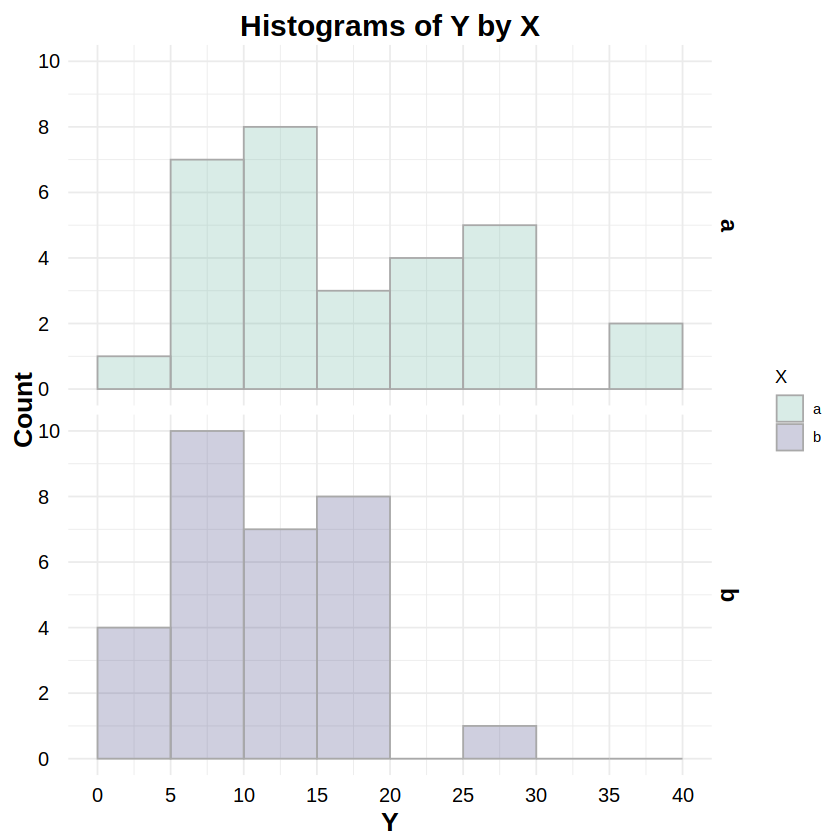
_exp:dexp,pexp,qexp,rexpReporting: “Figure 6 shows the distributions of response Y for both levels of factor X. To test whether these distributions were exponentially distributed, a Kolmogorov-Smirnov test was run on Y for both levels of X. The test for level ‘a’ was statistically non-significant (D = .107, p = .849), as was the test for level ‘b’ (D = .119, p = .742), indicating non-detectable deviations from an exponential distribution for both levels.”
# Example data
# df has one factor (X) w/two levels (a,b) and continuous response Y
df <- read.csv("data/1F2LBs_exponential.csv")
head(df, 20)
| S | X | Y | |
|---|---|---|---|
| <int> | <chr> | <dbl> | |
| 1 | 1 | a | 12.477962 |
| 2 | 2 | b | 5.975198 |
| 3 | 3 | a | 7.781088 |
| 4 | 4 | b | 16.940324 |
| 5 | 5 | a | 10.526902 |
| 6 | 6 | b | 4.675437 |
| 7 | 7 | a | 9.899636 |
| 8 | 8 | b | 23.608037 |
| 9 | 9 | a | 2.041000 |
| 10 | 10 | b | 5.257079 |
| 11 | 11 | a | 43.238041 |
| 12 | 12 | b | 13.202714 |
| 13 | 13 | a | 8.352570 |
| 14 | 14 | b | 5.377658 |
| 15 | 15 | a | 16.142961 |
| 16 | 16 | b | 1.901692 |
| 17 | 17 | a | 1.372129 |
| 18 | 18 | b | 12.738519 |
| 19 | 19 | a | 2.903349 |
| 20 | 20 | b | 25.792198 |
library(MASS) # for fitdistr
fa = fitdistr(df[df$X == "a",]$Y, "exponential")$estimate # create fit for X.a
ks.test(df[df$X == "a",]$Y, "pexp", rate=fa[1])
fb = fitdistr(df[df$X == "b",]$Y, "exponential")$estimate # create fit for X.b
ks.test(df[df$X == "b",]$Y, "pexp", rate=fb[1])
	Exact one-sample Kolmogorov-Smirnov test

data:  df[df$X == "a", ]$Y
D = 0.10665, p-value = 0.8491
alternative hypothesis: two-sided
	Exact one-sample Kolmogorov-Smirnov test

data:  df[df$X == "b", ]$Y
D = 0.11942, p-value = 0.7415
alternative hypothesis: two-sided
library(ggplot2)
library(ggthemes)
library(scales)

# Plot exponential histograms
# http://www.sthda.com/english/wiki/ggplot2-histogram-plot-quick-start-guide-r-software-and-data-visualization
ggplot(data=df, aes(x=Y, col=X, fill=X)) + theme_minimal() +
  # set the font styles for the plot title and axis titles
  theme(plot.title   = element_text(face="bold",  color="black", size=18, hjust=0.5, vjust=0.0, angle=0)) +
  theme(axis.title.x = element_text(face="bold",  color="black", size=16, hjust=0.5, vjust=0.0, angle=0)) +
  theme(axis.title.y = element_text(face="bold",  color="black", size=16, hjust=0.5, vjust=0.0, angle=90)) +
  # set the font styles for the value labels that show on each axis
  theme(axis.text.x  = element_text(face="plain", color="black", size=12, hjust=0.5, vjust=0.0, angle=0)) +
  theme(axis.text.y  = element_text(face="plain", color="black", size=12, hjust=0.0, vjust=0.5, angle=0)) +
  # set the font style for the facet labels
  theme(strip.text = element_text(face="bold", color="black", size=14, hjust=0.5)) +
  # create the histogram; the alpha value ensures overlaps can be seen
  geom_histogram(color="darkgray", binwidth=5, breaks=seq(0,50,by=5), alpha=0.25, position="identity") +
  # create stacked plots by X, one for each histogram
  facet_grid(X ~ .) +
  # determine the fill color values of each histogram
  scale_fill_manual(values=c("#69b3a2","#404080")) +
  # set the labels for the title and each axis
  labs(title="Histograms of Y by X", x="Y", y="Count") +
  # set the ranges and value labels for each axis
  scale_x_continuous(breaks=seq(0,50,by=5), labels=seq(0,50,by=5), limits=c(0,50)) +
  scale_y_continuous(breaks=seq(0,14,by=2), labels=seq(0,14,by=2), limits=c(0,14))
Gamma Distribution#
Parameterization: shape (α):
shape, rate (β):rateDistribution Functions:
_gamma:dgamma,pgamma,qgamma,rgammaReporting: “Figure 7 shows the distributions of response Y for both levels of factor X. To test whether these distributions were Gamma distributed, a Kolmogorov-Smirnov test was run on Y for both levels of X. The test for level ‘a’ was statistically non-significant (D = .116, p = .773), as was the test for level ‘b’ (D = .143, p = .526), indicating non-detectable deviations from a Gamma distribution for both levels.”
# Example data
# df has one factor (X) w/two levels (a,b) and continuous response Y
df <- read.csv("data/1F2LBs_gamma.csv")
head(df, 20)
| S | X | Y | |
|---|---|---|---|
| <int> | <chr> | <dbl> | |
| 1 | 1 | a | 10.345366 |
| 2 | 2 | b | 1.409266 |
| 3 | 3 | a | 6.433979 |
| 4 | 4 | b | 3.092545 |
| 5 | 5 | a | 3.943187 |
| 6 | 6 | b | 2.696895 |
| 7 | 7 | a | 4.507424 |
| 8 | 8 | b | 2.838128 |
| 9 | 9 | a | 5.451457 |
| 10 | 10 | b | 11.115251 |
| 11 | 11 | a | 5.308393 |
| 12 | 12 | b | 2.263850 |
| 13 | 13 | a | 6.573330 |
| 14 | 14 | b | 5.052664 |
| 15 | 15 | a | 3.564134 |
| 16 | 16 | b | 3.250415 |
| 17 | 17 | a | 10.281266 |
| 18 | 18 | b | 2.987387 |
| 19 | 19 | a | 3.656736 |
| 20 | 20 | b | 2.773202 |
library(MASS) # for fitdistr
fa = fitdistr(df[df$X == "a",]$Y, "gamma")$estimate # create fit for X.a
ks.test(df[df$X == "a",]$Y, "pgamma", shape=fa[1], rate=fa[2])
fb = fitdistr(df[df$X == "b",]$Y, "gamma")$estimate # create fit for X.b
ks.test(df[df$X == "b",]$Y, "pgamma", shape=fb[1], rate=fb[2])
	Exact one-sample Kolmogorov-Smirnov test

data:  df[df$X == "a", ]$Y
D = 0.11585, p-value = 0.7732
alternative hypothesis: two-sided
	Exact one-sample Kolmogorov-Smirnov test

data:  df[df$X == "b", ]$Y
D = 0.14293, p-value = 0.5258
alternative hypothesis: two-sided
library(ggplot2)
library(ggthemes)
library(scales)

# Plot gamma histograms
# http://www.sthda.com/english/wiki/ggplot2-histogram-plot-quick-start-guide-r-software-and-data-visualization
ggplot(data=df, aes(x=Y, col=X, fill=X)) + theme_minimal() +
  # set the font styles for the plot title and axis titles
  theme(plot.title   = element_text(face="bold",  color="black", size=18, hjust=0.5, vjust=0.0, angle=0)) +
  theme(axis.title.x = element_text(face="bold",  color="black", size=16, hjust=0.5, vjust=0.0, angle=0)) +
  theme(axis.title.y = element_text(face="bold",  color="black", size=16, hjust=0.5, vjust=0.0, angle=90)) +
  # set the font styles for the value labels that show on each axis
  theme(axis.text.x  = element_text(face="plain", color="black", size=12, hjust=0.5, vjust=0.0, angle=0)) +
  theme(axis.text.y  = element_text(face="plain", color="black", size=12, hjust=0.0, vjust=0.5, angle=0)) +
  # set the font style for the facet labels
  theme(strip.text = element_text(face="bold", color="black", size=14, hjust=0.5)) +
  # create the histogram; the alpha value ensures overlaps can be seen
  geom_histogram(color="darkgray", binwidth=2, breaks=seq(0,12,by=2), alpha=0.25, position="identity") +
  # create stacked plots by X, one for each histogram
  facet_grid(X ~ .) +
  # determine the fill color values of each histogram
  scale_fill_manual(values=c("#69b3a2","#404080")) +
  # set the labels for the title and each axis
  labs(title="Histograms of Y by X", x="Y", y="Count") +
  # set the ranges and value labels for each axis
  scale_x_continuous(breaks=seq(0,12,by=2), labels=seq(0,12,by=2), limits=c(0,12)) +
  scale_y_continuous(breaks=seq(0,14,by=2), labels=seq(0,14,by=2), limits=c(0,14))